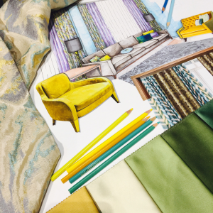
Combining prints is often considered a bold interior move, and it isn’t always easily achieved. With varying colours, directions and prints, it is often an overwhelming match. One that is not executed correctly, can often make an interior feel underwhelming. On the other hand, patterns that are successfully mixed, can bring vibrancy, a point of interest and texture. In our latest blog, we’ve highlighted five ways in which you can combine stunning prints to elevate your interior design.
Select a Colour Palette
During the initial planning stages of your interior design, it is vital to select a colour palette and stick to it. It’s very easy to get carried away while you are purchasing accessories, soft furnishings and paint, to lose sight of the sleek interior you are aspiring toward. Browse through the common colour schemes, use a colour wheel and maybe take some time to understand a little colour theory. By gaining an understanding of the complexity of complementary colours, your room is more likely to look flawless on completion.
Include Neutral Tones
For an easy interior and mix of patterns, selecting neutral base colours and tones is usually a safe decision. When you have decided on the colour of choice, whether that is olive, beige or grey, you can then scale through either darker or lighter tones, to achieve the neutral base colours for the room. These colours and tones make it much easier to mix and match patterns, as they provide an unfussy and calming block of colour.
Create Balance and Contrast
One of the biggest mistakes made when mixing patterns is when the chosen designs are competing for the eye’s immediate attention, instead of this, each should create a balance between. If you have chosen a bold and vibrant print, the other patterns you choose to use should be less attention-grabbing. This rule can also be transferred to the size of the pattern, if the print is large, it should be balanced with a smaller scale print. This allows different features within the room to complement each other much more effectively, while creating contrast and balance. It is also important that the patterns and prints you have chosen remain in the colours and tones of your pre-chosen colour palette.
Don’t Over Do it
It’s easy to fall in love with a pattern or a print, but this doesn’t mean you should decorate every inch of the room in it. For example, it is likely that tables, sofas, cushions and curtains all in the same material or print will not give you the mixed pattern interior you are aiming for. Instead, your prints should be contrasting in size and tone. We have a stunning selection of printed and patterned Venetian blinds, which will add the perfect contrasting pattern or texture to your home interior.
Be Daring
Creating an interior that you love should be fun, if you’re mixing patterns you have already made the tough decision of including them in your home interior, so, be bold and brave! Create a contrasting colour palette and include loud prints, as well as those more understated. An interior that has been carefully planned and aspects considered are more likely to pleasantly come together in comparison to those that haven’t been thought through. Create a mood board, visualise how colours, prints and textures will work together and craft a space you are proud of!